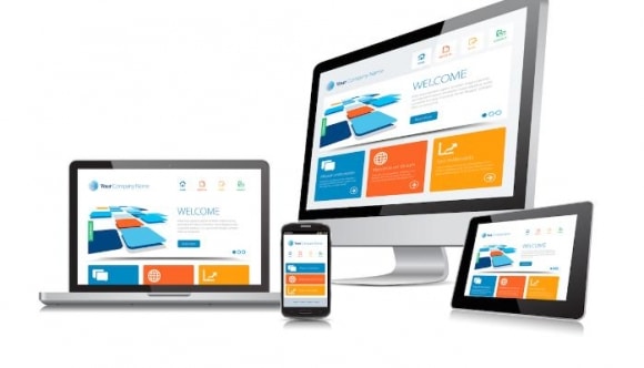
With the large number of mobile devices these days, it is easy to see why it is essential that web designers make their sites not only mobile ready, but be a responsive design that is able to change based upon the device that is used. While mobile design was a big deal over the last few years, now users are clamoring for responsive design to be able to fully enjoy and use websites no matter where they are.
Explaining Responsive Design Vs. Mobile Design
More people access the Internet using their mobile device than a computer. This means that how websites are designed has to be changed to meet the needs of the people that are coming to your site. While a mobile design works well with most smartphones and is thumb friendly, when the same design is used on a tablet, it may not work as well. This is where responsive design comes in. It is a liquid template that will respond to any size of device. Due to the fact it is a template, further modifications to the site do not need to be made, which is much more efficient.
Responsive Design User Benefits
Mobile design has many benefits that users can enjoy. The first one that they will enjoy is that the site will look the same from device to device. Nothing is worse than looking up a site on your smartphone and not being able to find the page you normally visit easily when you are on your computer. No scrolling or resizing is needed for a user to use your website fully, which increases their enjoyment of your site and will keep them coming back. A site that is hard to navigate will be one that many people will not want to return to.
SEO Benefits of Responsive Design
Responsive design is also good for SEO purposes. It will improve your overall quality scores, simply because it will offer a quality website to all of your users. In addition, it will still give you the separate scores of computer and mobile/traffic to allow you to see what types of devices your traffic most commonly uses. With the Google recommendation that all sites move into responsive design, you can see why it would be good for your SEO ratings. Furthermore, having a responsive design that is based on a template allows you to just have one SEO campaign, rather than one for your mobile site and one for your regular site.
Responsive design offers web designers a way to make their site work for everyone. The template is self-sizing, which allows it to work with any type of device. If you have a website, you want to be sure that your site can be used with any mobile device, whether phone, tablet, computer or laptop. By making your website responsive to any type of device, you can be sure that everyone who visits will be able to enjoy your site to the fullest.
If you want to learn more about responsive web design and if your website is in fact mobile friendly, feel free to connect with me further. Skol!
Ben Theis
Owner/Director, Skol Marketing
www.SkolMarketing.com
612.787.SKOL (7565)
btheis@skolmarketing.com