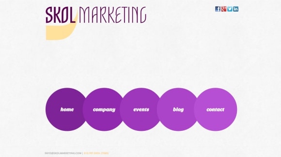
As you have probably noticed we decided to update and change our website. We wanted to go with a cleaner look that gives the user a better experience overall.
While we did love the layout of the old site, we were unable to offer users the experience we desired due to restrictions and issues resulting from the template. The website has been moved from WordPress and now gladly rests in Joomla’s hands. Nothing against WordPress, but we felt we were more comfortable with Joomla and could better functionality.
Some of the new features include:
1. A more functional Event page module
We implemented an event module from iCalagenda that really gives us great funtionality from the backend and frontend. It is very simple and fast to create the events on the backend, while giving a exterior a much needed facelift from our old site. We also love the new social media sharing capabilities built into the event module.
2. A better blog module
This template came with this great blog module that you are using right now. This module allows for easy creation of blogs in the backend with Titles, Keywords and picture implementation while giving it great user experience and exterior look. It is important to tag your blogs with keywords for internal and external search purposes.
3. Social Media connecting is much easier to find
We have moved our icons from the Contact page on our old site to the header of our new site. The icons look great in the upper righ hand corner and greet you when you first enter the page. You can now navigate to any of our platforms anytime while on the site. They also display much better with the lighter background.
4. Light Background
We decided to move away from the darker backgroung and foreground colors of black and purple to a brighter and cleaner off-white. This makes it easier for users to read and actually makes our logo, icons, and menus pop more off the page.
5. Mobile Site
We didn’t forget about our mobile site and completelyl overhauled that as well. This new template syncs MUCH better with our mobile platform and the design reads better with lighter background and contrasting text.
We will never forget where we came from and always remember our old layout but are exremely happy to make the switch and feel you will to. Please let us know your feedback on our new site, we would LOVE to hear it!
Skol,
Ben Theis


