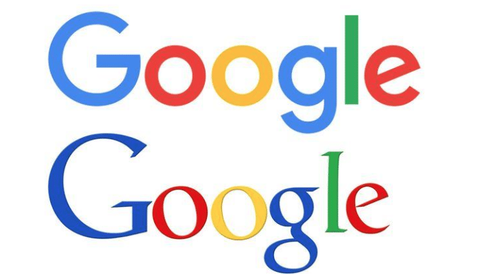
Can you believe it? The Google logo that you see when you type in google.com to any URL is actually the same logo we have seen for 16 years. Sure, Google has “tweaked” the logo for holidays and birthdays of very famous people. However, these were just 24-hour fun changes. The actual process of changing their logo, branding ad identity has not occurred since 1999. This was a period where most of us were either using Google to help search for data for high school research papers, or a time where you were building your professional career to where it is today. As the saying goes, all good things must come to an end, and Google has decided now was the time to make this happen.
What Was The Driving Force That Brought Such A Change?
This is actually an easy question to answer. Evolution. If you are not evolving, you are dying as the saying goes. Not many other companies have consistently been on the forefront of their business evolving and changing with the times more than Google has. This is just another example of it. Although Google has not changed their logo in almost two decades, they have evolved and changed by creating new and innovative ways to organize the world’s information. With some of these innovations, came new hardware and new software that we are already enjoying, such as Google wearable devices and even Google +.
In a multi-device and multi-screen world, users are connecting to Google in far more ways than just the traditional desktop and laptop computers. Users are now connecting and interacting with Google through tablets, watches, phones, and even glasses. With those thoughts in mind, Google says they are excited to “share a new brand identity that aims to make Google more accessible and useful to our users—wherever they may encounter it.”
The Google Homepage
Not many things are more reassuring than to log on to your internet device in the morning, and see the Google Homepage with its traditional, clean-looking white canvas, behind that “quirky”, multicolored Google logo. Unfortunately, technology has grown by leaps and bounds, and Google says that the current canvas, along with the inputs are in great need to become much more diverse.
An Insider’s View
Earlier in 2015, Google had a large company wide conference in New York, where they worked intensely for one week in what they called a “design sprint.” Below, they shared the draft they created which is located on their website too, of the four top challenges they really wanted to meet head on:
With all the new devices being designed by Google and other companies in the same technology vertical, better ways to interact and communicate with these other technologies and users needed to be addressed. Google feels they are continuing to go down this path and in the meantime, feet their brand should express this in the same simplistic way and delight that users have come to expect from a Google Homepage, regardless of the device or surface. For this, a new identity was needed in addition to a new design. Google wanted to take the first step by changing its logo. As the tech world continues to change, you can rest assured that Google will always meet these innovations at their apex, and keeping the user experience seamless and simplistic.


